Novelette - Branding
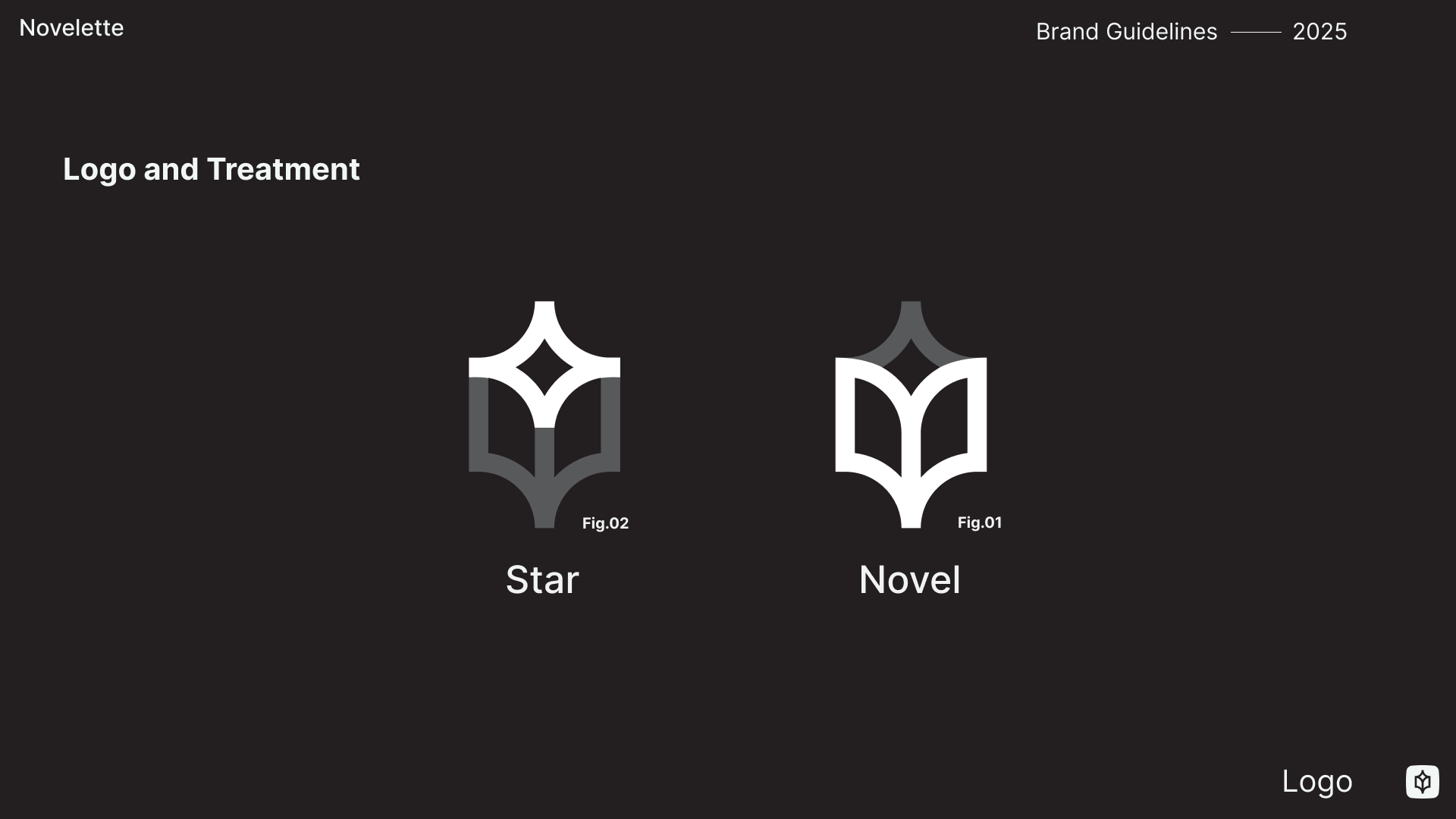
We named our motion studio after a long-forgotten literary form, the Novelette, which is even shorter than a novella. In the tradition of micro fiction, a good novelette is small but potent – just like us.
Exploring that contradiction in our name, we landed on the symbol of the star for the logo. Far away it’s a glimmer in an endless swath of night sky, but up close it’s a burning supernova. Building on that motif, we stretched the star upward to the heavens and, in doing so, created (fittingly) the shape of an open book.
The brand unfolded from there, with striking colours that read as both fresh and digitally native, but also retro in a pleasantly nostalgic sort of way. A plain sans serif typeface was an obvious choice to pay homage to the mid-century modernist tradition of iconic Canadian branding that we’re endlessly inspired by. To keep things from feeling too retro, we layered in a more editorial photographic style.